Friday 29 January 2016
Sweg Cat Photoshop (Photoshop Practice)

This cat was edited by me in Photoshop, I have put all of the social stereotypes of a so called 'Hipster' and put it all onto a cat and called him Sweg Cat. For those who don't know what a Hipster is its; a person who follows the latest trends and fashions, especially those regarded as being outside the cultural mainstream.
Hipsters are a subculture of men and women typically in their 20's and 30's that value independent thinking, counter-culture, progressive politics, an appreciation of art and indie-rock, creativity, intelligence, and witty banter.
Tuesday 26 January 2016
Friday 22 January 2016
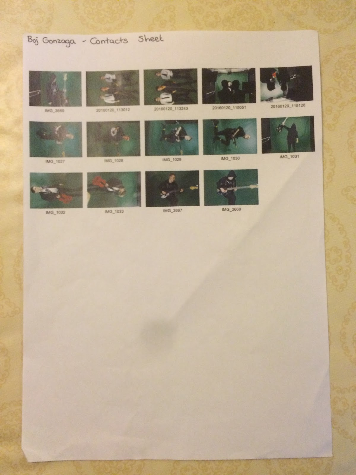
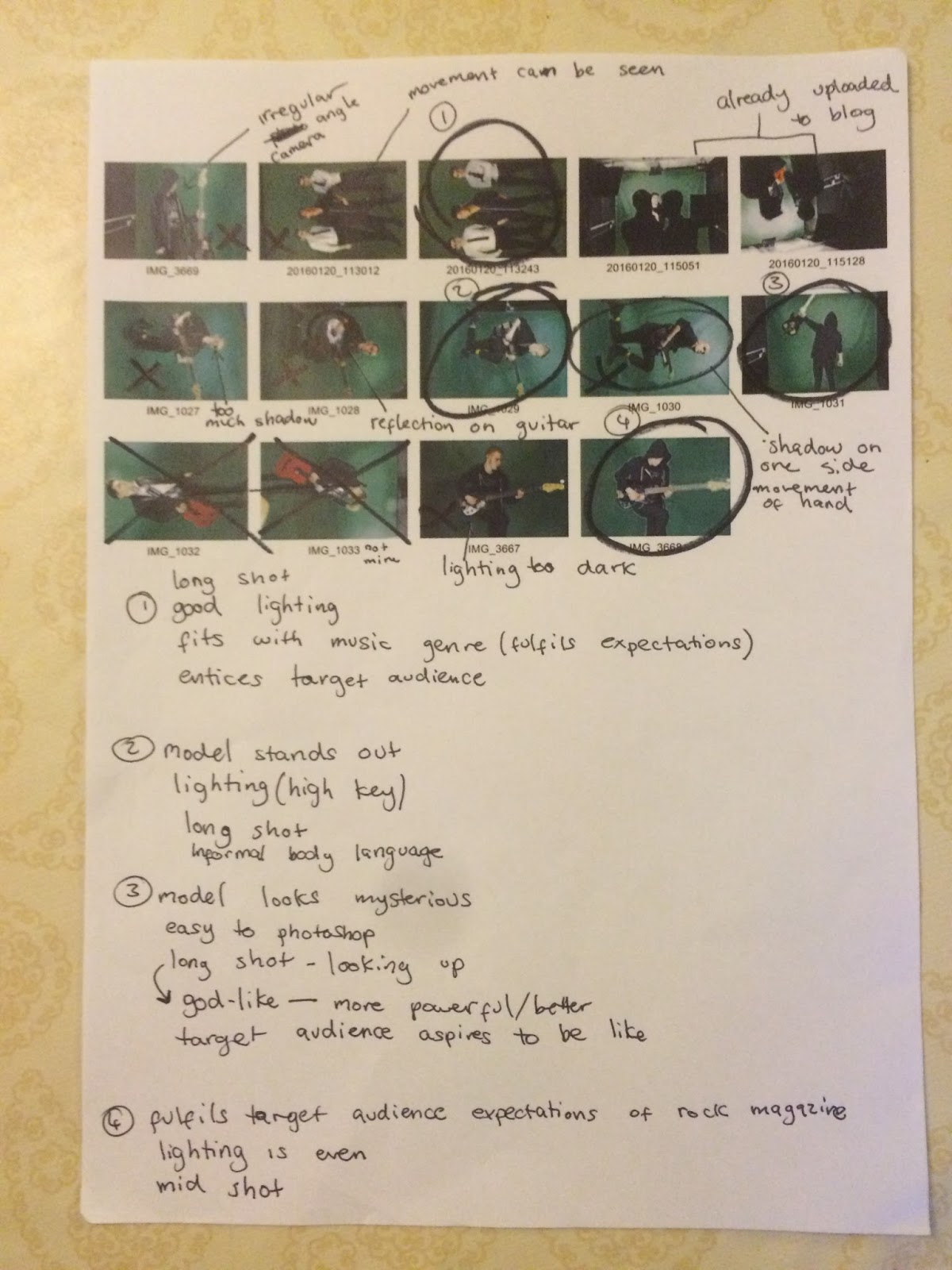
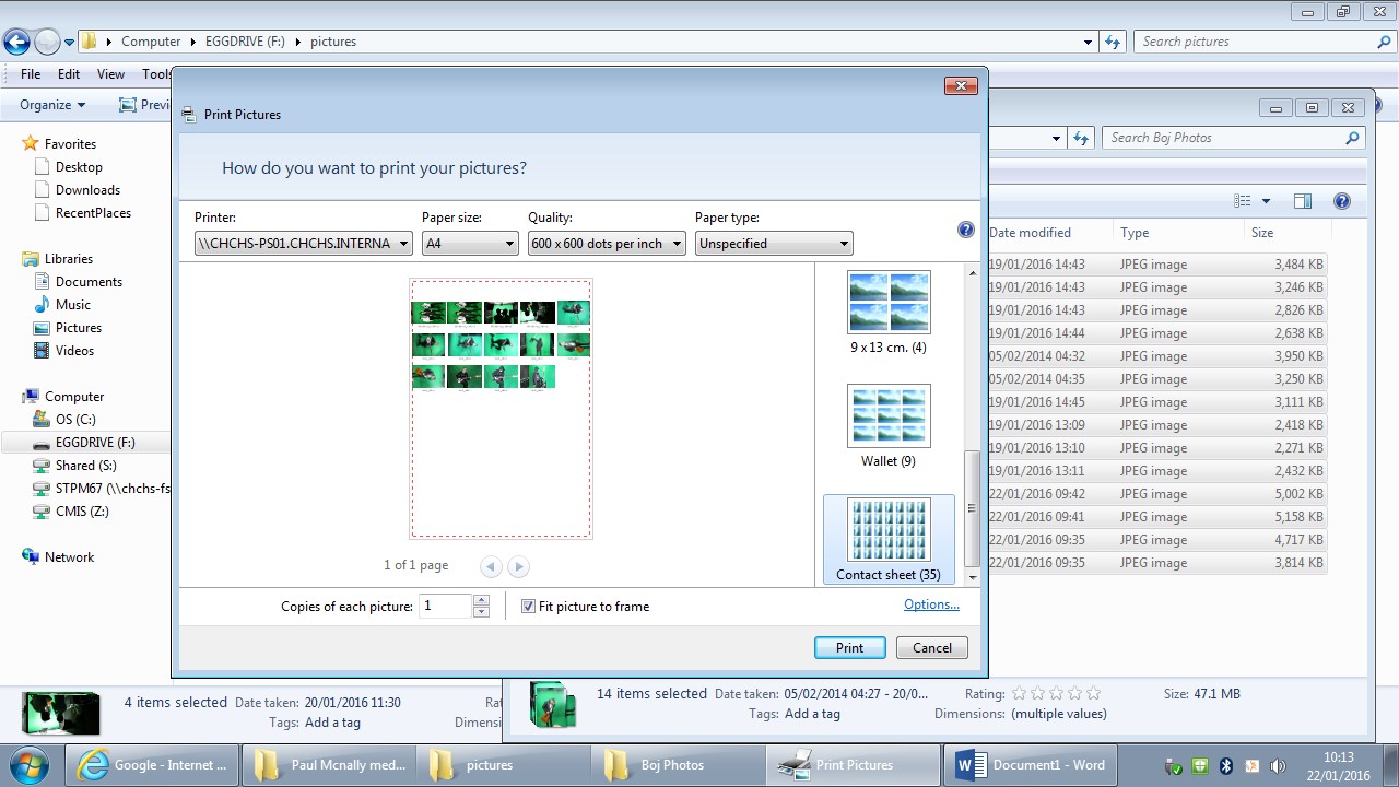
Music Magazine - Creation of Contact Sheet
This is how I created my contacts sheet. First I simply gathered all the images from my photo shoot and saved them onto my documents. Once I did this I simply highlighted all the images and selected contact sheet in print options, I then printed off the contact sheet. Creating a contact sheet is a great way of being able to look at all my images and once and compare and contrast them. With the contact sheet I could then choose my favourite images and then insert them into my double page spread.
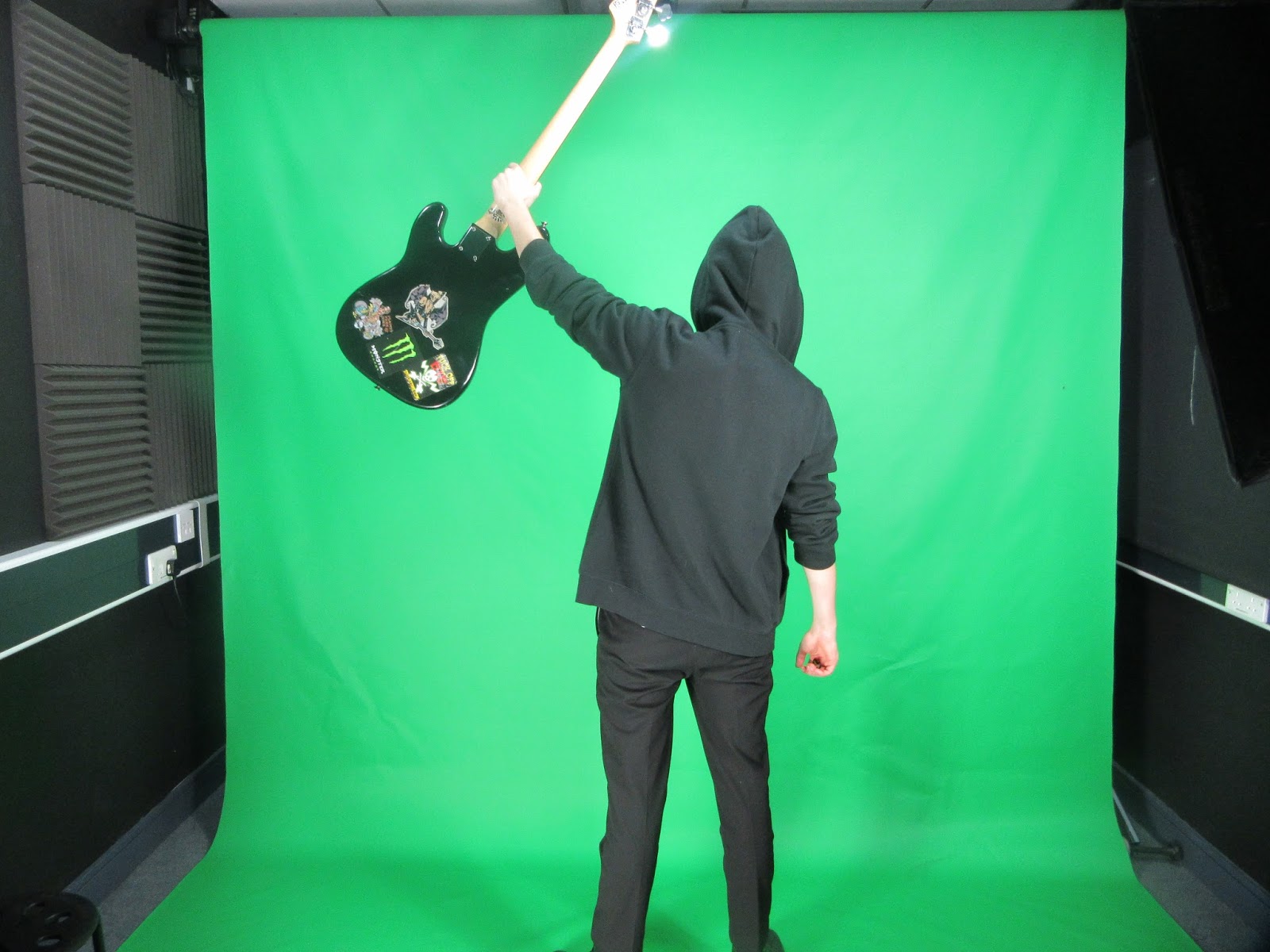
Behind The Scenes for Music Magazine
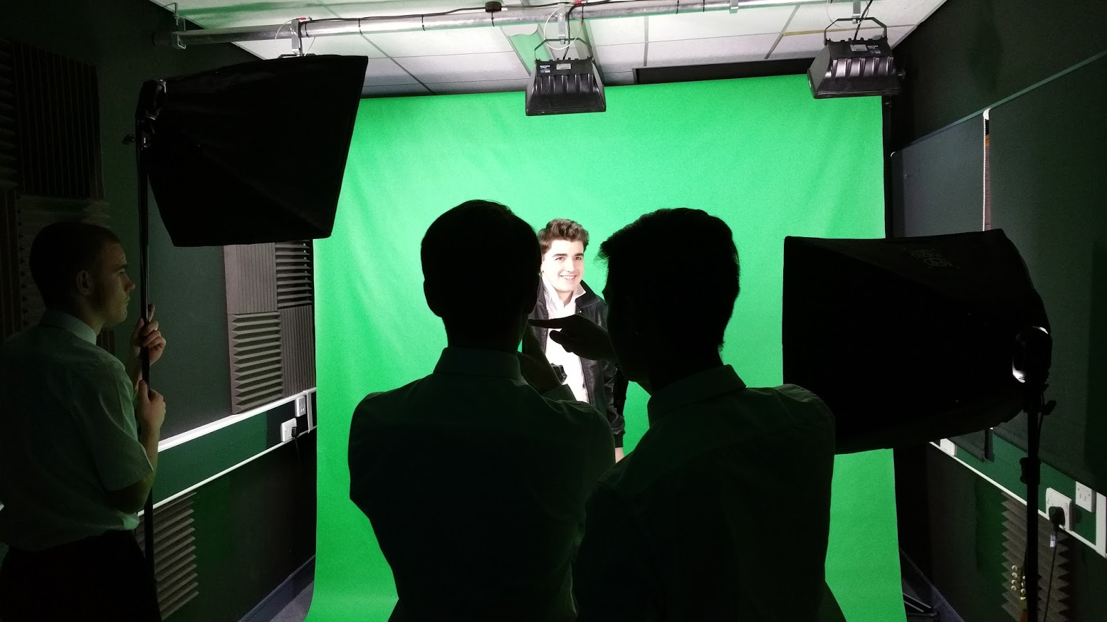 |
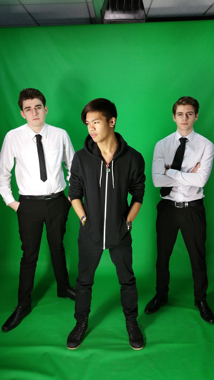
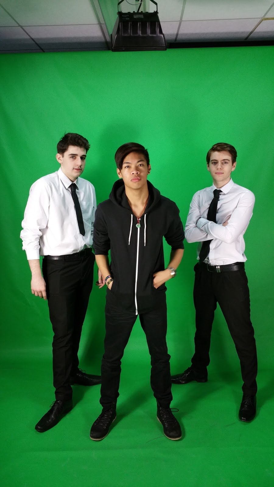
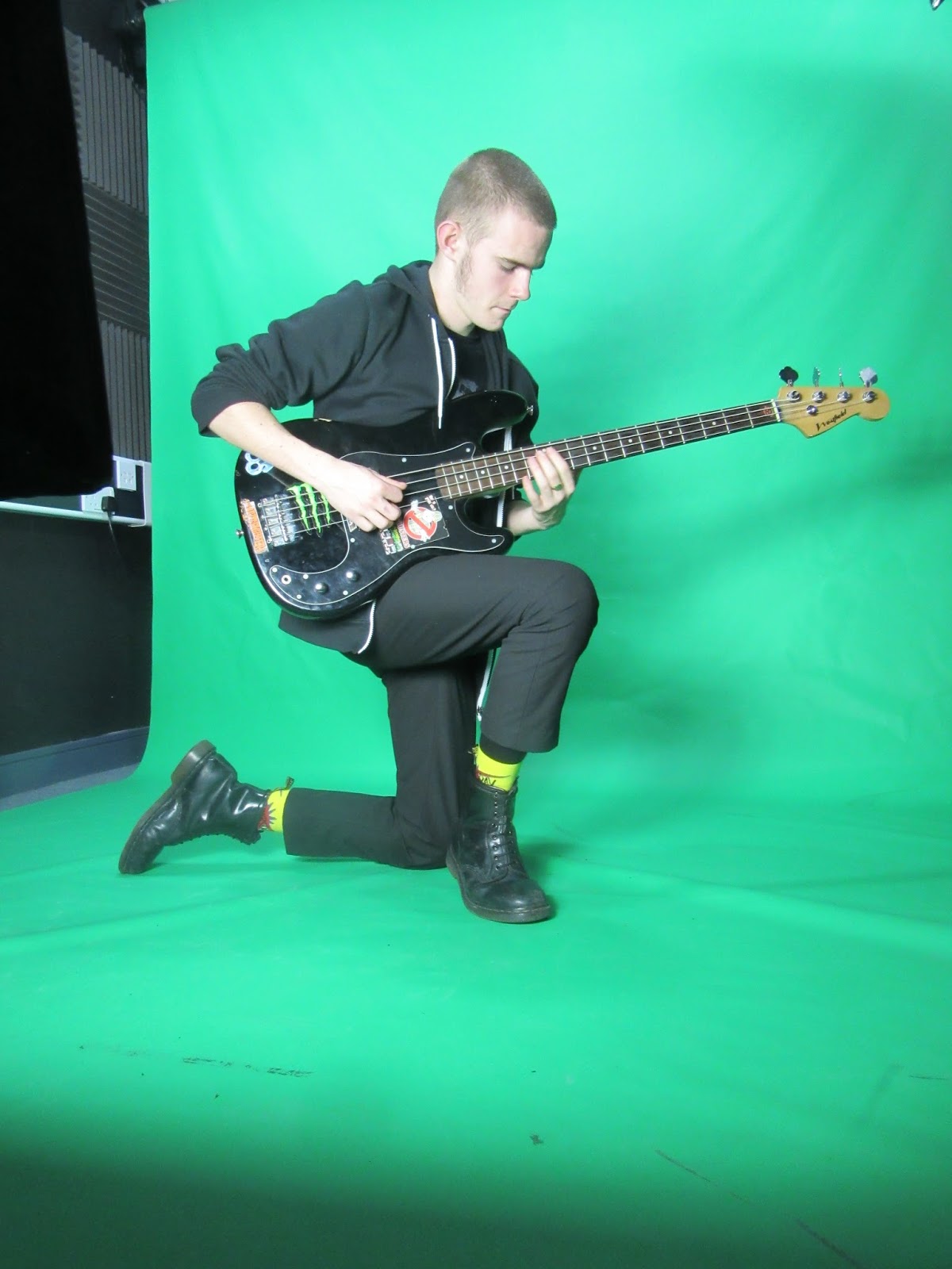
Here I helped my friend Owen in his photo-shoot as co-photographer, helping him fix his lighting using professional photo lights and directing Daniel where to stand on the green screen to get the best quality photo. The first photo we took was a wide shot and is a very good first attempt. However, shadows are very visible on the green screen and this could effect my editing. This picture suggested I needed to improve my lighting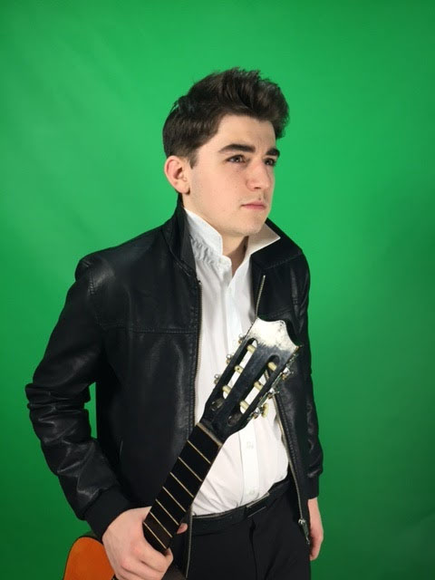 This is one of my most successful shots. As you can see the lighting is much better. This shows much more expression from the model and it is defiantly a picture my target audience would aspire to. The lighting is improved a lot more on this picture as Daniels face is really lit up and this shows his facial expression and emotion. The use of the shot showing the whole body makes Daniel look tall and therefore he is being represented as authoritative and powerful. |


Tuesday 12 January 2016
Music Magazine -Thumbnail Research
I have researched thoroughly into different music magazines. to do this I have chosen 2 magazines from America, 2 from the UK and another one from Germany to get a wider range of different magazines the contrast from each other.
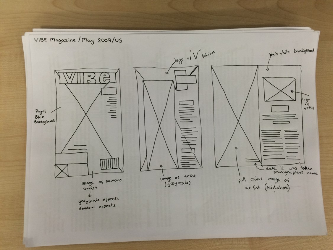 |
| This is a thumbnail layout for 'VIBE' magazine which is published in 2009 mainly in the reach of the US. I really like the image on the front cover of Jay Z because he is very famous and what the audience aspire to be like. |
 |
Layout for 'ACCESS!' magazine which is published in 2007 mainly distributed in Germany. The double page spread is much more lively than VIBE Magazine as it has a lot more text and it is much more colourful. Also, I like how the headline goes across both pages which is more eye catching to the audience |
 |
| Layout for 'Q' Magazine which is published in the UK in 2010. I like how the text wraps around the image as it makes the double page spread more unique which could in turn intrigue the audience to read on. The letter 'A' is emboldened and capitalised which I think makes the article more professional, because of this I think I will also use an emboldened and capitalised letter in my article aswell. |
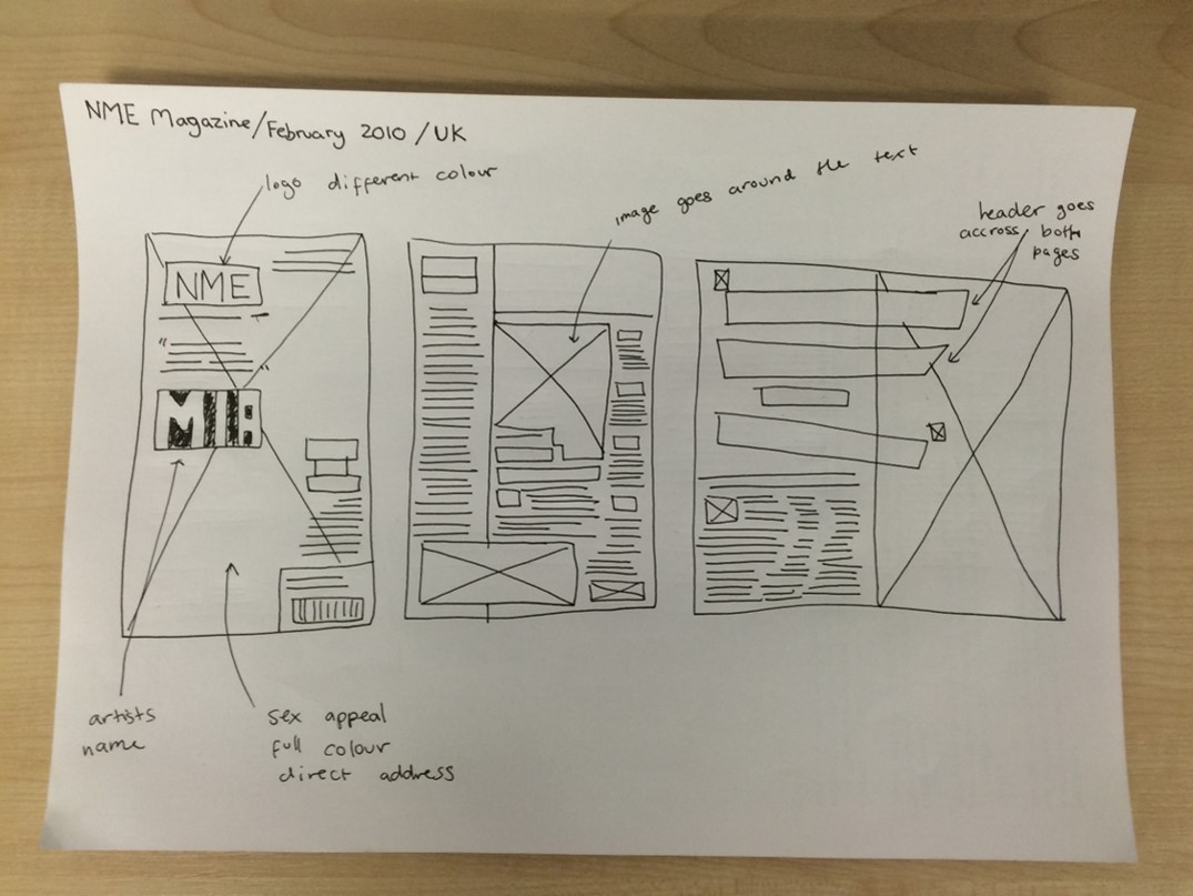 |
| Layout for 'NME' Magazine published in 2010 mainly circulated in the UK. I like the use of space and how the whole page is filled in a creative way on the contents page however, I feel like there is a bit too much going on and is hard to focus on one thing. I do think it is very eye catching and the most lives contents page I have looked at. |
 |
This layout is for 'Billboard' Magazine published in 2010 distributed in America. Even though it is from a different country it still has very similar codes and conventions to all the other real media magazines I have looked at. This suggests that magazines may be different in little ways, but overall most magazines follow the same codes and conventions because it fulfils the audience's expectations. |
Friday 8 January 2016


Subscribe to:
Posts (Atom)